Monday, November 29, 2010

Dangerous Design

There are many dangerous things in our world for one reason or another. Many of these dangerous things were not intended for harm, but led to it inadvertantly, and some other risks of danger are inevitable. An example of a good design that has led to dangers is that of the car. The car made it possible for us to travel. This mode of transportation was reliable and fairly inexpensive. Our society no longer had to stay in one city all their life. Job opportunities and lifes were found in cities around the country which would not have been possible if the car had not been invented.

Although cars are a great way to get around, it's inevitably a dangerous way of doing so. Like any other mode of transportation, there is an inherent risk. There is no way that you can control all aspects while driving, there are other people on the road, weather conditions, and unusual circumstances that have invariably led to accidents and death.

Brilliance BS6 ADAC crash testCars have become increasingly safer. The advent of the seatbelt, child seats, and air bags have protected many lives. We perform crash tests and safety tests to make sure that a human will survive upon impact. Safety ratings are public and should be researched before the purchase of the car. Even with all of these great innovations some models of cars just don't hold up to others.

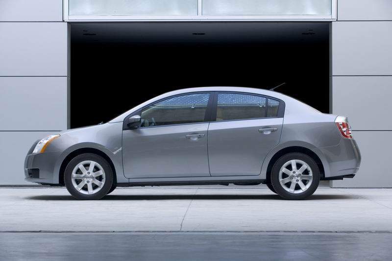
According to Forbes. com, the following cars got a two out of five star rating for both the frontal and rear-side impact crash tests: Kia Rio's Sedan, Nissan Sentra, and Mitsubishi Lancer. The following pick-up models have a two star rollover resistance rating: Ford Ranger, Mazda B-Series, and the Ford Explorer Sport Trac. The least reliable vehicle overall is the Lincoln Navigator. This high end, luxury vehicle has complicated technology that is prone to malfunction.

The designers of cars have an ethical responsiblity to create products that are as safe as possible. With all of our current technology, there really is no excuse. Crash test ratings should four stars and above before the company starts manufacturing the vehicle. Cars are a great invention but should not lead to death in order to cut production costs.

Sunday, November 28, 2010

Utopian Design

Our planet can not live forever. Every single person living on this world leaves behind a carbon footprint. Our carbon footprint let's us know the impact we have on our planet because of our daily habits. Driving everyday to work or school, not recycling, leaving electronics running all the time are all examples of habits that do damage to our planet in the long run. Lowering our carbon emissions will enable the inhabitants of our planet to live a long, healthy existence. Cutting down on our bad habits will ensure us an environment that will live right along with us.

A great way to cut down our electricity consumption is through solar panels. Solar energy has been around since the 1970's but in order to use this new technology you needed panels that were huge and unsightly. Placing these panels on houses and buildings was a large hassle that was extremely expensive and was not very aesthetically appealing.

The solar panel design has recently become more attainable and more engaging to earth conscious people. A solar powered shingle has been created to fit seamlessly onto a roof. This technology that has been produced to help lower our footprint has become a unique design tool. The shingles are a genius way to create interest in the solar technology. People no longer have to worry about an eyesore situated on their roof. The shingles produce enough energy to power your whole house. On a sunny day the shingles could produce more than your consumption and actually cause your electric meters to count backwards. Some states will even buy unused electricity that has been produced by the shingles. Solar energy is the way of the future!


A Colorful Transformation

Color is a useful tool to designers to produce a product that consumers feel is unique. Color can be a way to help sell an item or get a certain viewpoint across. Color can change mood or help make sense of something visually. A good case in which color transforms a design is in book covers. 

Book covers are very important. They are the first thing you see when you look at a book. The book cover has to grab the attention of the reader and therefore must be ultra appealing. There are way too many books in a store for customers to search through. Most people browse books without even reading anything about the book over than the title. The book cover must lure these overwhelmed customers in and color is a great way to do so. 


A customer will not necessarily remember the name of a book nor will they remember the story, but if the book cover does its job correctly, the book will stand out in your mind in some small way. A good example of a book cover that uses color to it's advantage is the Harry Potter series. As the picture illustrates, the use of color sets the tone for each book while still keeping a palette that ties the books together. Each book is bright and bold and leaves nothing to the imagination. These colors produce an effective approach to the use of color for book covers. 


Although J.D. Salinger preferred his books have no information save the name of the book and author, this turns out to be a very bland book cover. Salinger is a great writer, but nowadays nobody would pick Raise High the Roof Beam ,Carpenters up. Catcher in the Rye is a famous work by Salinger. The Catcher in the Rye is a much more appealing book because of the cover and happens to be more famous than Salinger's aforementioned book, I wonder why... The image on the cover of The Catcher in the Rye has even been made into a t-shirt design sold by Urban Outfitters.

Friday, November 12, 2010

The Bug: Design Withstanding the Ages

The Volkswagen Beetle was originally developed in Germany when Adolf Hitler gave the order to Ferdinand Porsche to create quite literally a people's car. The car was meant to hold two adults and three children and was available to the citizens of the Third Reich at a decent price. This car has lasted for almost one hundred years and has remained popular and iconic throughout the century.


The Volkswagen was nicknamed the "Beetle" in Germany, and the name stuck with it as sales hit America. The Beetle has been mostly unchanged from the original design plans from 1938. The engine was located in the rear and was four cylinders, the car featured rear wheel drive and had only two doors. The current Beetles have changed some of these features, but the outside of the car looks mostly the same. Beetles have become trendy cars that assume bright colors, whereas before they were mostly just primer colors grey and white. The curves of the vehicle and the body shape looks quite similar up until now.


The Volkswagen company is testing out a brand new model of the Beetle. This model no longer accentuates the curves that we are so used to in the Beetle. The roof is less curved and more boxy. It no longer looks like a car that is worried about their own unique design, but more of a car that will blend in with all the rest. This new version of the Beetle looks more like a PT Cruiser, which in my opinion is the worst looking car, than I would have ever liked. The Beetle needs to worry less about changing the form of the car, rather they should look into creating a safer car that is more reliable. The look of the Beetle has worked for decades, changing it now will not be to their benefit. Why fix something that isn't broken?  

Ergonomics of Design

The keyboard is not something I often associate with design, but it is just that. A good design should be seamless. A good design should not even feel like it is designed, and that's what the keyboard feels like to me. The basis of any design should look at the ergonomics of the product. The research process should include: safety, comfort, ease of use, performance, and aesthetics.


 The use of the keyboard is relatively safe, you can't really hurt yourself too bad unless you are using it wrong. The keyboard has in some cases caused carpal tunnel syndrome. Having your hands in the wrong position makes you at risk of getting the disease or at least an uncomfortable pain in your wrists. Keyboard companies do make models that focus more on the ergonomic qualities than some other companies. These keyboards are sometimes split so that you can type at a different angle than regular straight keyboards, and others focus on minimizing muscle strain by elevating the keyboard and maximizing comfort.


All of the letters, symbols, and numbers are arranged strategically on the keyboard. The design plan is for a specific purpose, which is efficiency and ease of use. Having the alphabet laid out in the "QWERTY"way, doesn't necessarily make sense right away. If I were to make a keyboard I would probably just put the alphabet on their how its written; A B C D and so on. Having the unique layout of the keys produces efficiency. The keys are placed in the optimum position according to the letters we use the most often in the English language. Careful thought was put into the placing of the keys which created an easy tool in order to navigate the internet.

Various forms of the keyboard are used for every computer in the world. The keyboard is the easiest way to navigate in the virtual world along with a mouse. The keyboard is easy to use, and simple to learn. Form follows function really well in this case. The alphabet is arranged perfectly in order to type quickly. The productivity of a keyboard versus something that is hand written is phenomenal. The keyboard allows us to quickly fix mistakes and continue on with the process speedily. If the keyboard wasn't as well designed it wouldn't be as well received and wide spread.


Finally we come to the last part of the design process, aesthetics. The modern keyboard is not the nicest thing to look at. The keyboard on the typewriter was another sight to see though. The typewriter is a piece of nostalgia. Everything about it seemed beautiful and hand crafted. Now, keyboards are more for practical use and not so much for aesthetics. Typewriters in the past were worth keeping and displaying in your office. Nowadays, keyboards are stashed under your computer desk in a drawer that can be neatly concealed. No longer is the keyboard in a place of prominence.

Keyboards are a great design overall. They are proficient for the task that the consumer asks them to do. Keyboards provide an ease of use that virtually anyone can learn. The only thing they don't hit home on is the aesthetic appeal. A pop of color, a funky type face, something would give it what this world of design so desperately needs. Black, white, and silver just don't cut it anymore.

Sunday, November 7, 2010

Icons: the Language of Symbols

What if the world didn't have iconography, the language of signs and symbols? On our way to work traffic would be a mess. Nobody would understand what that red octagonal shape is at the corner of the street. We probably wouldn't even be able to find the freeway let alone drive on it safely. And when you finally got to your destination, how would you even know that you had arrived?

We use these signs and symbols as a sort of shorthand language. Everyone accepts the meaning of these symbols. Iconography is a sort of language without words, a universal language. Symbols are used in every aspect of the world we live in. Going to a new place, you can spot immediately what room the bathroom is and for which sex it belongs to.

We rely on symbols in our everyday lives and the design of them is crucial. The design has to be concise and to the point. An icon that is unclear is an unsuccessful icon. People from around the world should be able to see the icon and know immediately what it means, despite cultural differences. Icons must convey a message with ideas instead of words and are definitely a crucial part of our society.

Saturday, November 6, 2010

Cosmopolitan: The Obvious Relationship Between Words and Images

Magazines use a blend of relationships with words and images that help bring diversity and interest to the magazine. The variety of relations between  the two help bring a certain aesthetic and style to the magazine in order to lure in the readers. That style attracts the readers attention and is what keeps them coming back for more. We mostly see this present in the covers of magazine articles. Bold pictures and interest piquing headlines are a must. Cosmopolitan Magazine has got the relationship just right. Cosmopolitan has cover articles that grasp your attention and make you want to pick the magazine right off the shelf which is important for a magazine that is in direct competition with every other magazine on the same shelf.

Not only is the cover important for a magazine to catch your attention, but so too does the magazine's content. The article layout is an important part of attracting a reader. After looking at the front of a magazine, it's inevitable that the reader looks inside directly after. It would be a complete disaster if the insides of the magazine were bare and boring. The reader would immediately put down the magazine and pick up the next.

This article to the left illustrates one of the layouts that Cosmopolitan uses for their articles. They used the color green to emphasize the title and headlines because the story is about green and sustainable living. The picture and word relationship is one where the picture backs up the word's meaning. The picture alone would not convey the stories meaning, but the words alone definitely would; the picture just backs up the story. The juxtaposition of both words and images is crucial to the magazine's popularity and readability. 

Thursday, November 4, 2010

Words and Images: The Spice of Life

Comic books show an important relationship between both words and images. A comic without both of these elements, is no real comic at all. According to Scott McCloud author of Understanding Comics, his definition of comics is "Juxtaposed pictorial and other images in deliberate sequence, intended to convey information and/or produce an aesthetic response in the viewer." In comics, the illustration is an essential part. Comics are set apart because of their use of illustration that is totally different than a simple book with pictures. The story is told through images, but just as important are the words and phrases attached to the illustrations.

McCloud tells of different ways in which we can understand the relationship between  words and pictures in a comic in his illustrated book, Understanding Comics, the Invisible Art. It turns out that there are many different ways in which the two interact with each other to produce a successful story. The first type of relationship between the two is "picture-specific" where the words are just a back up role to the pictures. "Duo-specific" means just what the title suggests, the words and pictures say basically the same thing. the most important and most commonly used of the different relationships is the "independent" relationship where words and pictures convey a concept that would not make sense without each other. In this relationship the words and images are supported by one another and the meaning would be lost without both being present.
The relationships that McCloud points out in his book are very important to understanding how they act together. Words and images are a cohesive part of a whole and work fluently with one another to produce an effect that creates a superior product.


Sunday, October 31, 2010

Tortuous Freeways Cause Problems

Freeways are a significant part of our ever day life. I use one freeway to get to school another to get to work and yet another to visit friends and family. They need to be efficient and take into careful consideration the way that cars function and how the brain reacts. Freeways get us from point A to point B, but I doubt anyone really scrutinizes their design elements on an every day basis.

I recently moved to Sacramento from the Los Angeles region. In Southern California I noticed there were many freeways that connected so that I had as little side street driving as possible. The 210 freeway was built near my house only a couple of years ago and featured long on and off ramps and many lanes including a carpool lane.

In Sacramento I am somewhat disappointed with the configuration of freeways. They never seem to connect where you need them to, and it's difficult to get from one to the other. I have noticed that the freeways are rarely straight and feature many curves that make you slow down dramatically. The last thing a motorist wants to do is decrease their speed especially because it wastes gas and takes longer to get where you are going. Off and on ramps here are not very conducive to getting on a high speed freeway which slows down traffic.

It may seem weird that I have taken the time to talk about freeways, but they are a big part of my life. Freeways, major roads, and highways in the Sacramento region really need a good makeover to become more efficient and safe for everyone.


A Flaw in Yogurt

I eat yogurt almost every morning. Yoplait yogurt has a large variety of flavors that no other yogurt brand carries such as Boston Cream Pie! The taste of the yogurt is the natural reason why I continually choose this product, but there is a large design flaw that seriously deters me from buying Yoplait when I'm in the grocery store.


The Yoplait yogurt cup is iconic. The label is easy to read and to the point. The cup has an easily recognizable tapered rectangular shape. Without even seeing the label for Yoplait I know right away what brand this yogurt belongs to. Some say that is great design, I beg to differ.


The shape of the Yoplait yogurt cup is all wrong. I spend literally five minutes every morning trying to scrape out yogurt remnants from the grooves within the cup. The yogurt container is too small, I cannot even use a regular spoon, but must get a baby size spoon just to get anything out in the first place! Those five minutes every morning add up! Time is money and a busy consumer will not bother to take that extra time no matter how good that yogurt is. I say Yoplait needs a new container that matches the needs of its consumers!

Saturday, October 30, 2010

Form and Content: Objectified


Gary Hustwit's film Objectified, tells of the manufacturers relationship to products before the product is finalized. The film delves into the creative process for the design of many objects in our daily life that we do not even notice were designed in the first place. A potato peeler, something seemingly simple and organic was put to the test by some designers. Hustwit films the process that the designers for a potato peeler went through in order to get an ergonomic shape that would everyone's purposes. In order to understand what people need, designers look at extreme cases. For example, a person with arthritis and an athlete are going to use an object much differently and that needs to be represented in the design.

Through Objectified, I realized that design really is a large part of of our everyday world. Things that I normally don't think about are deeply scrutinized by the manufactures who produce them. Hustwit also researchers the objects relationship with the consumer. A great design is something that  is natural, something that when you think about it, you think of course it's this way. The Apple company seems to be the only company that is really concerned with design. Although form and content are not necessarily equal in the Apple company, the product is very successful. Form does not follow function with their products. Looking at an I-Pod, you don't immediately see what it does, but the sleek package makes it desirable.

Saturday, October 16, 2010

Comparison

Pixar Animation Studios is my all time favorite source for animation as well as Disney. The mash-up between Pixar and Disney studios was the most genius merger and probably one of the most powerful. Nobody knows how to make a cartoon based movie more accessible to every age range like Disney's Pixar. The characters are lovable, relate-able, and have a sense of wit to them, that no other cartoon company could ever get close to.

Pixar all began in 1984 when John Lasseter left an animation job at Disney to work with George Lucas' special effects computer group. Lasseter's first project was The Adventures of Andre and Wally B. The computer group in which Lasseter was involved got bought out by Steve Jobs and officially became known as "Pixar". Here is a link to Pixar's History where I got my information. After years of incredible films and innumerable awards, Pixar has become an icon in the household. I would like to show the differences between Pixar's oldest project, "The Adventures of Andre and Wally B". with one of their most recent short films "Partly Cloudy".

As I mentioned above "The Adventures of Andre and Wally B". was the very first project that Lasseter worked on at the unofficial Pixar company. In 1984, the production of this film was groundbreaking, although it may not look like much now because of our fast-paced technological growth. This film was the first of it's kind to use "motion blur" in CG animation and complex 3-D backgrounds.

"Partly Cloudy" was released in 2009 before the film "Up". A specific style has certainly been developed after the many years that Pixar has been making shorts. Compared to Andre, the movies are very different. The characters are more well developed, and I think you fall in love with them more readily. While the plots of both of the short films are simple, the most recent short is a little more complex in storyline. The animation in "Partly Cloudy" is more seamless and pleasing to the eye. Upon first seeing "Andre", I felt bored, the exact opposite emotion was stirred within me upon seeing "Partly Cloudy". 

Pixar has really grown as a company. Their accomplishments and awards are very befitting of the outstanding work they have produced for over two decades. The team at Pixar is exceptional, their quality of films are outstanding and their level of genius is yet to be matched. 

Friday, October 15, 2010

Design as Conversation

Does design converse? This question is at the root of the topic design as conversation. If design really is able to converse, how exactly does it take place? I believe that there are many ways in which design is a conversation. The most obvious answer would be the conversation that takes place between client and designer. A designer usually conjures a product for someone other than themselves. In order to understand what your client wants and the restrictions with which they want you to operate you need communication. Without a constant stream of dialog at every point of the design process, something could go wrong. If the line of communication is disconnected, there could be a large discrepancy  about what the client wanted and what the designer produced.

Another way in which design is conversation takes place in the design process before anything happens. A designer must ask themselves what they can do. Can the designer comfortably work within the set of guidelines that the client sets forth? And then the designer must ask themselves, what are they going to do? What ideas do I have to make the design the best it can be? A conversation with yourself, although maybe not consciously, is the best way to start a new assignment.

Design is also a conversation through inspiration. A product could potentially provide another designer with inspiration. That inspiration, in turn, creates a piece that speaks to the first. The two designs are complementary and one was inspired by the other. Conversation sometimes inspires others to reach new heights and design is no exception.

"This Train is Bound for Glory"

Yesterday I attended the guest lecture series which featured a photographer by the name of Justine Kurland. I had never seen any of her works and have never attended an artist's lecture. Kurland started her presentation showing a photo by Carlton Watkins called Cathedral Rocks and Spires. Watkins was part of a geological survey expedition which helped promote the Westward Expansion. Kurland began her lecture with pictures such as the one done by Watkins because the movement towards the west was filled with dreams and new chances which is a main theme within her body of work.
Carlton Watkins, Cathedral Rocks and Spires, 1865-66


After graduating from Yale, Kurland focused on a theme of runaway girls. The shots were all staged and the girls were not actually runaways but these photos evoked a feeling of innocence not yet lost. After the runaway girls, she decided to focus her photographs on communes and then moved onto nude photos. Kurland then became a mom and got caught up in the world of parenting. Her next line of work focused on naked "mamas" and their babies. Justine Kurland's son, Casper, became a big part of her work life. Casper was interested in trains, so Kurland shot trains. Again the theme of Westward Expansion was emphasized with the trains.

Kurland's body of work is very interesting. I love the singular theme that runs through all of the subjects she shoots. This theme seems to be ingrained in her being and her one goal is to carry out its significance. Justine Kurland is a very unique person. She goes on month long road trips and lives out of a car to get the perfect shot. Her work is a commitment and a passion and it really shows.
The artist Justine Kurland at her show 
This Train is Bound for Glory. Photo Shawn Dogimont

Sunday, October 10, 2010

You Are a Product

Recently, while searching the internet for entertainment I found an arresting article. The article, entitled "What Does Your Facebook Profile Say About You?", laid claim to a very small amount of people actually knowing what kind of impression their Facebook gave on most people. In the work place people were scared to post too much about themselves and ended up seeming very stuffy while others put it all of their information out there for anyone to gaze upon. I have already been aware of the dangers of too much information on any web page could lend to, but this article really got me thinking about the design aspect to your online profiles.


Upon further investigation I found the site Geekologie where they had a fun flowchart on the topic of what your profile picture says about you. Although the website is poking fun at people who crop out their bodies in pictures and who take the infamous "mirror shot", the article really does give a good insight on what goes on in people's minds when they put their picture online. Choosing the perfect shot can either make or break a new 
connection with another person.


Online networking sites are usually places to meet new people or get to know more about someone you already have met. In a way you are marketing yourself to an audience. What you say about yourself, the pictures you post, and the overall aesthetic of the profile are setting an example of who you are. This is another case where both words and pictures interact. Posting pictures of yourself on social networks can say something totally different about you and your personality than what you write about yourself. The truth is not always so evident online.


Friday, October 8, 2010

Creativity from Without

Different cultures and places from around the world can be a great source of inspiration. There is a wealth of ideas and techniques that other communities have perfected that you may not have even thought of before. Everyone has a different point of view and getting to know more about the world's views makes for a more well rounded designer.


In some places a certain wood is more abundant than other kinds of woods. The land could be rich with limestone and could be used throughout most buildings. Learning and using building materials that are diverse can really alter something that you are creating. Using wood as opposed to marble for a project could take it to a whole different level. Culture is also a large part of the world's designs. Religion can totally dominate a society and everything within it. Take the Vatican for example, the Catholic church has so much power in Italy that they have a part of Italy all to their selves. They dictate everything from the clothes you can wear to the laws that are made. Their building styles show a rich religious influence. 


I have had the pleasure in being able to go to Bangkok, Thailand and Salvador, Brasil within the last couple years and am going to travel to Barcelona, Spain in the winter. Going to these diverse places gives me the opportunity to see the differences in the nation's points of view. Although Bangkok and Salvador were both heavily influenced by there religious beliefs, their styles are so unalike. I was afforded the great opportunity to observe two societies that are totally contrasting which gave me inspiration. Creativity fuels creativity.

Photo I took of a Church in Brasil:

Wednesday, October 6, 2010

Stone Soup for the Designer's Soul

Stone Soup is an inspiring folk story in which a group of hungry soldiers enters a town looking for food. The townspeople see the men coming and decide to hide all of their food. The soldiers stop at every house but are denied any food. The men then come up with a plan and ask the townspeople for a pot of boiling water and they throw a couple stones in too. The soldiers ask for little things to be put in the soup such as salt and a carrot, eventually every towns person offers something to be entered into the soup making a very appetizing meal for all. The moral of the story shows that participation and cooperation ends in the best results.

With the theme of this story in mind we were asked to bring a bunch of materials that we could use to create anything artistic. Our group put our heads together and came up with an innovation based on the materials that were presented. the bulk of the items that were brought was cardboard, because of this we decided to cut shapes out of the cardboard decorate them with scraps of paper, stickers, paint, etc and then cut slits in them to create something grand. In the end our cardboard and papers turned into a 3-D object. The outcome was planned out but never could have been imagined in its entirety. Our group's teamwork and own experiences created something that none of the other groups had come close to. Different items and different people would definitely not have come up with the same piece of work and that is what is so special about Stone Soup.

Everyone collaborated to make something better than any one person could do on their own, in this way we created out own designer Stone Soup. 

Sunday, October 3, 2010

Cakes!

I love cake! Birthdays, graduations, retirements, Sundays...any day is a good day for cake! The design of the cakes are equally as important as how they taste, especially if it's for a special occasion and not just a random day where you get the "cake craves", that is why my go-to comedic website is Cake Wrecks.The creator of the blog Cake Wrecks asks people to send in pictures of cakes that they ordered specifically for an event made by professional bakers. As is apparent from the title of the blog, the designs that are submitted to the blog are usually cakes of epic failures. The image below is supposed to be a Mickey Mouse cake for a child's first birthday! I think turning one year old is a pretty momentous occasion, I would certainly not pay for a monstrosity such as this.
My other favorite cakes are the ones that you see in a grocery store. Talent is really not the number one factor in hiring these people. The worst cakes are cupcake cakes where an image is made up of some cupcakes and icing. This picture I took while I was browsing the bakery section at my local Ralph's. This isn't even the worse of the cupcake cakes division, but you can kind of see what I mean with how bad it can get. I mean since when does a football look like that?
Once in a while there are actually beautiful or creative cakes that get posted on this blog and it's interesting to see the large difference in talent among the cake decorators. The design of a cake is crucial in sending a trend for the kind of occasion that you are having. A wedding cake, for example, is usually a center piece of the whole wedding and will encompass the theme of the wedding and the personality of the couple. Often a cake will show appreciation or congratulations much like giving a card would. The cake should come from your heart and a poorly executed cake definitely does not give the client what they need. Cakes are not usually a big part of our everyday lives but when an occasion is important enough to call for a cake, buying one should be a thing of excitement not of worry because you don't know what you are going to get.

A Wedding Fit for a DISNEY Princess?

While checking my email on Yahoo.com I came across an article entitled "Disney Princess Wedding Gowns" and pictures of both The Little Mermaid and Beauty and the Beast. Immediately they had my attention. Coming from Southern California, I have always been obsessed with Disneyland and everything else Disney related. Living half an hour away from the Disneyland theme park was a dream. I was naturally excited to see a new and inventive take on the Disneyland  Princess enterprise.

Upon further investigation I was delighted to see that Alfred Angelo, bridal designer, made seven dresses befitting of seven of the Disney princesses. Ariel, Aurora,  Belle, Cinderella, Jasmine, Snow White, and the newest Disney Princess Tiana. All of these leading ladies had fantastical dresses created in their image.


Many women that are getting married want a perfect day and let's put it plainly, want to be spoiled. Having a Disney Princess dress would give the bride a real feel of being a princess. Having the perfect wedding day is synonymous with having that perfect dress that you feel like the center of attention in, and I think that by having a Princess dress designed by Alfred Angelo makes perfect sense. Disney always has a grandiose style which you can feel immediately in their films and by walking in the theme parks, these dresses are in that same tradition. The Disney-Angelo mash-up was a perfect success in my book.


Thursday, September 30, 2010

Where the Sidewalk Ends: My First Taste of Design


Where the Sidewalk Ends is a wildly imaginative collection of poems by the famed author, poet, song-writer, cartoonist, Shel Silverstein. He uses his talents of poetry and drawing in this wonderful book made just for children, but as I can attest, enjoyed by adults as well. The poems are all from a child's perspective with themes such as not wanting to go to school and never wanting to take the trash out. Where the Sidewalk Ends puts a modern day twist on children's books the likes of Mother Goose could never catch up to. 

This children's book of poetry is my first real experience with design. Flipping through the pages of the book is an adventure within itself. Without reading a word, you can tell what the story is about just by looking at the wondrous illustrations that depict the poems with the utmost care. Some poems are long, and some are very short, but you can always expect to see a great illustration on every page.
Silverstein knew who his readers were and modified his book accordingly. His talents were put to good use by creating a children's book that children would actually enjoy. I have long passed the age for which books like these are made for, but I continue to draw inspiration from this silly and wonderful book of poems as I'm sure many others have as well. Where the Sidewalk Ends is great design from how the text is placed, to the themes of the poems, to how the illustrations are drawn. The sense of wonderment that the reader feels  tells us how well Silverstein executed his design point of view.