

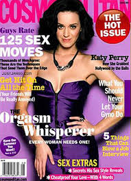
Magazines use a blend of relationships with words and images that help bring diversity and interest to the magazine. The variety of relations between the two help bring a certain aesthetic and style to the magazine in order to lure in the readers. That style attracts the readers attention and is what keeps them coming back for more. We mostly see this present in the covers of magazine articles. Bold pictures and interest piquing headlines are a must. Cosmopolitan Magazine has got the relationship just right. Cosmopolitan has cover articles that grasp your attention and make you want to pick the magazine right off the shelf which is important for a magazine that is in direct competition with every other magazine on the same shelf.
 Not only is the cover important for a magazine to catch your attention, but so too does the magazine's content. The article layout is an important part of attracting a reader. After looking at the front of a magazine, it's inevitable that the reader looks inside directly after. It would be a complete disaster if the insides of the magazine were bare and boring. The reader would immediately put down the magazine and pick up the next.
This article to the left illustrates one of the layouts that Cosmopolitan uses for their articles. They used the color green to emphasize the title and headlines because the story is about green and sustainable living. The picture and word relationship is one where the picture backs up the word's meaning. The picture alone would not convey the stories meaning, but the words alone definitely would; the picture just backs up the story. The juxtaposition of both words and images is crucial to the magazine's popularity and readability.
No comments:
Post a Comment