Monday, November 29, 2010

Dangerous Design

There are many dangerous things in our world for one reason or another. Many of these dangerous things were not intended for harm, but led to it inadvertantly, and some other risks of danger are inevitable. An example of a good design that has led to dangers is that of the car. The car made it possible for us to travel. This mode of transportation was reliable and fairly inexpensive. Our society no longer had to stay in one city all their life. Job opportunities and lifes were found in cities around the country which would not have been possible if the car had not been invented.

Although cars are a great way to get around, it's inevitably a dangerous way of doing so. Like any other mode of transportation, there is an inherent risk. There is no way that you can control all aspects while driving, there are other people on the road, weather conditions, and unusual circumstances that have invariably led to accidents and death.

Brilliance BS6 ADAC crash testCars have become increasingly safer. The advent of the seatbelt, child seats, and air bags have protected many lives. We perform crash tests and safety tests to make sure that a human will survive upon impact. Safety ratings are public and should be researched before the purchase of the car. Even with all of these great innovations some models of cars just don't hold up to others.

According to Forbes. com, the following cars got a two out of five star rating for both the frontal and rear-side impact crash tests: Kia Rio's Sedan, Nissan Sentra, and Mitsubishi Lancer. The following pick-up models have a two star rollover resistance rating: Ford Ranger, Mazda B-Series, and the Ford Explorer Sport Trac. The least reliable vehicle overall is the Lincoln Navigator. This high end, luxury vehicle has complicated technology that is prone to malfunction.

The designers of cars have an ethical responsiblity to create products that are as safe as possible. With all of our current technology, there really is no excuse. Crash test ratings should four stars and above before the company starts manufacturing the vehicle. Cars are a great invention but should not lead to death in order to cut production costs.

Sunday, November 28, 2010

Utopian Design

Our planet can not live forever. Every single person living on this world leaves behind a carbon footprint. Our carbon footprint let's us know the impact we have on our planet because of our daily habits. Driving everyday to work or school, not recycling, leaving electronics running all the time are all examples of habits that do damage to our planet in the long run. Lowering our carbon emissions will enable the inhabitants of our planet to live a long, healthy existence. Cutting down on our bad habits will ensure us an environment that will live right along with us.

A great way to cut down our electricity consumption is through solar panels. Solar energy has been around since the 1970's but in order to use this new technology you needed panels that were huge and unsightly. Placing these panels on houses and buildings was a large hassle that was extremely expensive and was not very aesthetically appealing.

The solar panel design has recently become more attainable and more engaging to earth conscious people. A solar powered shingle has been created to fit seamlessly onto a roof. This technology that has been produced to help lower our footprint has become a unique design tool. The shingles are a genius way to create interest in the solar technology. People no longer have to worry about an eyesore situated on their roof. The shingles produce enough energy to power your whole house. On a sunny day the shingles could produce more than your consumption and actually cause your electric meters to count backwards. Some states will even buy unused electricity that has been produced by the shingles. Solar energy is the way of the future!


A Colorful Transformation

Color is a useful tool to designers to produce a product that consumers feel is unique. Color can be a way to help sell an item or get a certain viewpoint across. Color can change mood or help make sense of something visually. A good case in which color transforms a design is in book covers. 

Book covers are very important. They are the first thing you see when you look at a book. The book cover has to grab the attention of the reader and therefore must be ultra appealing. There are way too many books in a store for customers to search through. Most people browse books without even reading anything about the book over than the title. The book cover must lure these overwhelmed customers in and color is a great way to do so. 


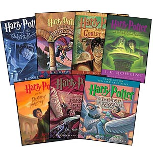
A customer will not necessarily remember the name of a book nor will they remember the story, but if the book cover does its job correctly, the book will stand out in your mind in some small way. A good example of a book cover that uses color to it's advantage is the Harry Potter series. As the picture illustrates, the use of color sets the tone for each book while still keeping a palette that ties the books together. Each book is bright and bold and leaves nothing to the imagination. These colors produce an effective approach to the use of color for book covers. 


Although J.D. Salinger preferred his books have no information save the name of the book and author, this turns out to be a very bland book cover. Salinger is a great writer, but nowadays nobody would pick Raise High the Roof Beam ,Carpenters up. Catcher in the Rye is a famous work by Salinger. The Catcher in the Rye is a much more appealing book because of the cover and happens to be more famous than Salinger's aforementioned book, I wonder why... The image on the cover of The Catcher in the Rye has even been made into a t-shirt design sold by Urban Outfitters.

Friday, November 12, 2010

The Bug: Design Withstanding the Ages

The Volkswagen Beetle was originally developed in Germany when Adolf Hitler gave the order to Ferdinand Porsche to create quite literally a people's car. The car was meant to hold two adults and three children and was available to the citizens of the Third Reich at a decent price. This car has lasted for almost one hundred years and has remained popular and iconic throughout the century.


The Volkswagen was nicknamed the "Beetle" in Germany, and the name stuck with it as sales hit America. The Beetle has been mostly unchanged from the original design plans from 1938. The engine was located in the rear and was four cylinders, the car featured rear wheel drive and had only two doors. The current Beetles have changed some of these features, but the outside of the car looks mostly the same. Beetles have become trendy cars that assume bright colors, whereas before they were mostly just primer colors grey and white. The curves of the vehicle and the body shape looks quite similar up until now.


The Volkswagen company is testing out a brand new model of the Beetle. This model no longer accentuates the curves that we are so used to in the Beetle. The roof is less curved and more boxy. It no longer looks like a car that is worried about their own unique design, but more of a car that will blend in with all the rest. This new version of the Beetle looks more like a PT Cruiser, which in my opinion is the worst looking car, than I would have ever liked. The Beetle needs to worry less about changing the form of the car, rather they should look into creating a safer car that is more reliable. The look of the Beetle has worked for decades, changing it now will not be to their benefit. Why fix something that isn't broken?  

Ergonomics of Design

The keyboard is not something I often associate with design, but it is just that. A good design should be seamless. A good design should not even feel like it is designed, and that's what the keyboard feels like to me. The basis of any design should look at the ergonomics of the product. The research process should include: safety, comfort, ease of use, performance, and aesthetics.


 The use of the keyboard is relatively safe, you can't really hurt yourself too bad unless you are using it wrong. The keyboard has in some cases caused carpal tunnel syndrome. Having your hands in the wrong position makes you at risk of getting the disease or at least an uncomfortable pain in your wrists. Keyboard companies do make models that focus more on the ergonomic qualities than some other companies. These keyboards are sometimes split so that you can type at a different angle than regular straight keyboards, and others focus on minimizing muscle strain by elevating the keyboard and maximizing comfort.


All of the letters, symbols, and numbers are arranged strategically on the keyboard. The design plan is for a specific purpose, which is efficiency and ease of use. Having the alphabet laid out in the "QWERTY"way, doesn't necessarily make sense right away. If I were to make a keyboard I would probably just put the alphabet on their how its written; A B C D and so on. Having the unique layout of the keys produces efficiency. The keys are placed in the optimum position according to the letters we use the most often in the English language. Careful thought was put into the placing of the keys which created an easy tool in order to navigate the internet.

Various forms of the keyboard are used for every computer in the world. The keyboard is the easiest way to navigate in the virtual world along with a mouse. The keyboard is easy to use, and simple to learn. Form follows function really well in this case. The alphabet is arranged perfectly in order to type quickly. The productivity of a keyboard versus something that is hand written is phenomenal. The keyboard allows us to quickly fix mistakes and continue on with the process speedily. If the keyboard wasn't as well designed it wouldn't be as well received and wide spread.


Finally we come to the last part of the design process, aesthetics. The modern keyboard is not the nicest thing to look at. The keyboard on the typewriter was another sight to see though. The typewriter is a piece of nostalgia. Everything about it seemed beautiful and hand crafted. Now, keyboards are more for practical use and not so much for aesthetics. Typewriters in the past were worth keeping and displaying in your office. Nowadays, keyboards are stashed under your computer desk in a drawer that can be neatly concealed. No longer is the keyboard in a place of prominence.

Keyboards are a great design overall. They are proficient for the task that the consumer asks them to do. Keyboards provide an ease of use that virtually anyone can learn. The only thing they don't hit home on is the aesthetic appeal. A pop of color, a funky type face, something would give it what this world of design so desperately needs. Black, white, and silver just don't cut it anymore.

Sunday, November 7, 2010

Icons: the Language of Symbols

What if the world didn't have iconography, the language of signs and symbols? On our way to work traffic would be a mess. Nobody would understand what that red octagonal shape is at the corner of the street. We probably wouldn't even be able to find the freeway let alone drive on it safely. And when you finally got to your destination, how would you even know that you had arrived?

We use these signs and symbols as a sort of shorthand language. Everyone accepts the meaning of these symbols. Iconography is a sort of language without words, a universal language. Symbols are used in every aspect of the world we live in. Going to a new place, you can spot immediately what room the bathroom is and for which sex it belongs to.

We rely on symbols in our everyday lives and the design of them is crucial. The design has to be concise and to the point. An icon that is unclear is an unsuccessful icon. People from around the world should be able to see the icon and know immediately what it means, despite cultural differences. Icons must convey a message with ideas instead of words and are definitely a crucial part of our society.

Saturday, November 6, 2010

Cosmopolitan: The Obvious Relationship Between Words and Images

Magazines use a blend of relationships with words and images that help bring diversity and interest to the magazine. The variety of relations between  the two help bring a certain aesthetic and style to the magazine in order to lure in the readers. That style attracts the readers attention and is what keeps them coming back for more. We mostly see this present in the covers of magazine articles. Bold pictures and interest piquing headlines are a must. Cosmopolitan Magazine has got the relationship just right. Cosmopolitan has cover articles that grasp your attention and make you want to pick the magazine right off the shelf which is important for a magazine that is in direct competition with every other magazine on the same shelf.

Not only is the cover important for a magazine to catch your attention, but so too does the magazine's content. The article layout is an important part of attracting a reader. After looking at the front of a magazine, it's inevitable that the reader looks inside directly after. It would be a complete disaster if the insides of the magazine were bare and boring. The reader would immediately put down the magazine and pick up the next.

This article to the left illustrates one of the layouts that Cosmopolitan uses for their articles. They used the color green to emphasize the title and headlines because the story is about green and sustainable living. The picture and word relationship is one where the picture backs up the word's meaning. The picture alone would not convey the stories meaning, but the words alone definitely would; the picture just backs up the story. The juxtaposition of both words and images is crucial to the magazine's popularity and readability. 

Thursday, November 4, 2010

Words and Images: The Spice of Life

Comic books show an important relationship between both words and images. A comic without both of these elements, is no real comic at all. According to Scott McCloud author of Understanding Comics, his definition of comics is "Juxtaposed pictorial and other images in deliberate sequence, intended to convey information and/or produce an aesthetic response in the viewer." In comics, the illustration is an essential part. Comics are set apart because of their use of illustration that is totally different than a simple book with pictures. The story is told through images, but just as important are the words and phrases attached to the illustrations.

McCloud tells of different ways in which we can understand the relationship between  words and pictures in a comic in his illustrated book, Understanding Comics, the Invisible Art. It turns out that there are many different ways in which the two interact with each other to produce a successful story. The first type of relationship between the two is "picture-specific" where the words are just a back up role to the pictures. "Duo-specific" means just what the title suggests, the words and pictures say basically the same thing. the most important and most commonly used of the different relationships is the "independent" relationship where words and pictures convey a concept that would not make sense without each other. In this relationship the words and images are supported by one another and the meaning would be lost without both being present.
The relationships that McCloud points out in his book are very important to understanding how they act together. Words and images are a cohesive part of a whole and work fluently with one another to produce an effect that creates a superior product.