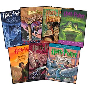
Color is a useful tool to designers to produce a product that consumers feel is unique. Color can be a way to help sell an item or get a certain viewpoint across. Color can change mood or help make sense of something visually. A good case in which color transforms a design is in book covers.
Book covers are very important. They are the first thing you see when you look at a book. The book cover has to grab the attention of the reader and therefore must be ultra appealing. There are way too many books in a store for customers to search through. Most people browse books without even reading anything about the book over than the title. The book cover must lure these overwhelmed customers in and color is a great way to do so.

A customer will not necessarily remember the name of a book nor will they remember the story, but if the book cover does its job correctly, the book will stand out in your mind in some small way. A good example of a book cover that uses color to it's advantage is the Harry Potter series. As the picture illustrates, the use of color sets the tone for each book while still keeping a palette that ties the books together. Each book is bright and bold and leaves nothing to the imagination. These colors produce an effective approach to the use of color for book covers.
Although J.D. Salinger preferred his books have no information save the name of the book and author, this turns out to be a very bland book cover. Salinger is a great writer, but nowadays nobody would pick Raise High the Roof Beam ,Carpenters up. Catcher in the Rye is a famous work by Salinger. The Catcher in the Rye is a much more appealing book because of the cover and happens to be more famous than Salinger's aforementioned book, I wonder why... The image on the cover of The Catcher in the Rye has even been made into a t-shirt design sold by Urban Outfitters.


No comments:
Post a Comment